Content Goals and Principles
With every piece of content we publish, we aim to: (the REAS formula) (Respect, Educate, Advise, Satisfy)
- Respect. Treat readers with the respect they deserve. Put yourself in their shoes, and don’t patronize them. Remember that they have other things to do. Be considerate and inclusive. Don’t market to people. Communicate with them.
- Educate. Tell readers what they need to know, not just what we want to say. Give them the exact information they need, along with opportunities to learn more. Remember that you’re the expert, and readers don’t have access to everything you know.
- Advise. Think of yourself as a tour guide for our readers. Whether you’re leading them through a product review or a blog post, communicate in a friendly and helpful way. Give them the best advice you have. Recommend the appropriate product to them.
- Satisfy. Help people to get satisfied with information related to OBD by using language that informs them and encourages them to use OBD scan tools to diagnose and fix their vehicles.
In order to achieve those goals, we make sure our content is: (the CUFA formula) (Clear, Useful, Friendly, Appropriate)
- Clear. Understand the topic you’re writing about. Use simple words and sentences.
- Useful. Before you start writing, ask yourself: What purpose does this serve? Who is going to read it? What do they need to know?
- Friendly. Write for humans, not for engines. Don’t be afraid to break a few language rules if it makes your writing more relatable. Use “I” for the author and “you” for the readers. All of our content should be warm and human.
- Appropriate. Write in a way that suits the situation. Just like you do in face-to-face conversations, adapt your tone depending on who you’re writing to and what you’re writing about.
Voice and tone
One way we write empowering content is by being aware of our voice and our tone.
This section explains the difference between voice and tone, and lays out the elements of each as they apply to OBD Advisor.
What’s the difference between voice and tone?
Tone, voice, and mood all relate to how the writer or brand comes across to its audience. But they are different.
Think of voice, tone, and mood this way:
- Voice is who we are. It defines our relationship with our customers. Our brand character and voice attributes define our voice, and we can adapt it to meet customer needs. Voice should be constant across all articles – it’s the website/author’s personality shining through.
- Tone is based on the mood of our customers and can help us understand their emotions to connect with them more. Context is key when exploring mood. Tone should be constant across a single piece of content.
- If tone is the attitude the writer or character takes in a piece, mood is the emotional atmosphere the author creates. Mood can shift and change within a piece.
The table below shows how different voice and tone are:
| Tone | Voice |
| In a written work, tone is a window into a writer’s “attitude toward the subject matter or audience,” according to the Literary Devices website.A character in a book conveys a certain tone; so might the author of the book. | Voice, on the other hand, is a brand’s trademark characteristic that comes across on all the posts of the website. It’s the voice of OBD Advisor (as a brand).Here’s how MasterClass defines voice: “the rhetorical mixture of vocabulary, tone, point of view, and syntax that makes phrases, sentences, and paragraphs flow in a particular manner.” |
| Tone takes the voice’s personality a step further and changes based on your needs. | Voice is your personality as a writer or brand. |
| Tone may change from topic to topic. | Voice keeps the same in the whole website |
| Tone is the variable that changes with each piece or campaign | Voice is a constant |
Take the New York Times. The newspaper has always had an authoritative and informative voice, but its tone changes depending on the topic.
Its story about what summer tastes like in America takes a warm, nostalgic tone while an article on the pandemic learning loss has a more serious, thoughtful tone.
Voice
Our Personality
- Helpful
- Professional
- Trustworthy
Voice Chart
| Personality | Descriptions | Should | Shouldn’t |
| Helpful | The helpful content system aims to better reward content where visitors feel they’ve had a satisfying experience, while content that doesn’t meet a visitor’s expectations won’t perform as well. | – Clearly demonstrate first-hand expertise and a depth of knowledge (for example, expertise that comes from having actually used a product or service) – Leave the users feeling that they’ve learned enough about the topic to help achieve their goal. – Get the users reading your content leave feeling like they’ve had a satisfying experience. | – Summarize what others have to say without adding much value. – Leave readers feeling like they need to search again to get better information from other sources. |
| Professional | We’re experts in the topics we write. We show a lot of appropriate knowledge and/or skill to our readers. | – Let our readers know that you’re an auto mechanic. – Show various knowledge and skills to our readers. – Include stories, examples, and images in your articles. – Show your experiences. Tell our readers what is good and what is bad about things. – Use clear and straigth-forward language. | – Shouldn’t go around the topic. – Shouldn’t make our readers confused about anything. |
| Trustworthy | We make our website the go-to source of information about the topic we write. | – Provide our readers with accurate information. – Show our readers that you are able to be relied on as honest or truthful. – Show our readers the confidence you have about the topic. | – Shouldn’t give our readers information that you’re not sure about. |
Tone
OBD Advisor’s tone is usually informal, but it’s always more important to be clear than entertaining. When you’re writing, consider the reader’s state of mind (or reader’s mood). Are they in an emergency situation? Is it a serious problem? Are they confused and seeking help on Google, Quora, Reddit, etc.?
Once you have an idea of their mood, you can adjust your tone accordingly.
OBD Advisor has a sense of humor, so feel free to be funny when it’s appropriate and when it comes naturally to you. But don’t go out of your way to make a joke – forced humor can be worse than none at all. If you’re unsure, keep a straight face.
Accessibility
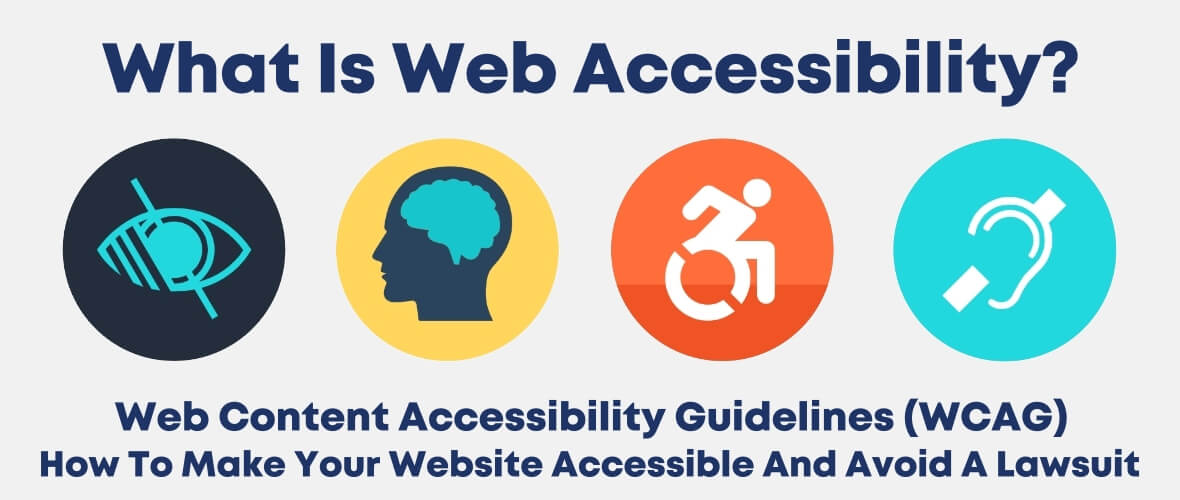
Accessibility is the practice of making information, activities, and/or environments sensible, meaningful, and usable for as many people as possible.
A common example of accessibility that we have all likely encountered, is in the context of architectural design. Consider the “accessible entrance” to buildings.
Railings, ramps, self-operating doors, lifts/elevators, signs, lighting, even the width and height of steps of a staircase all represent accessible design elements.
Each function to increase, improve, or eliminate a barrier to a person’s access to a building or structure, and, therefore, that which is housed inside.

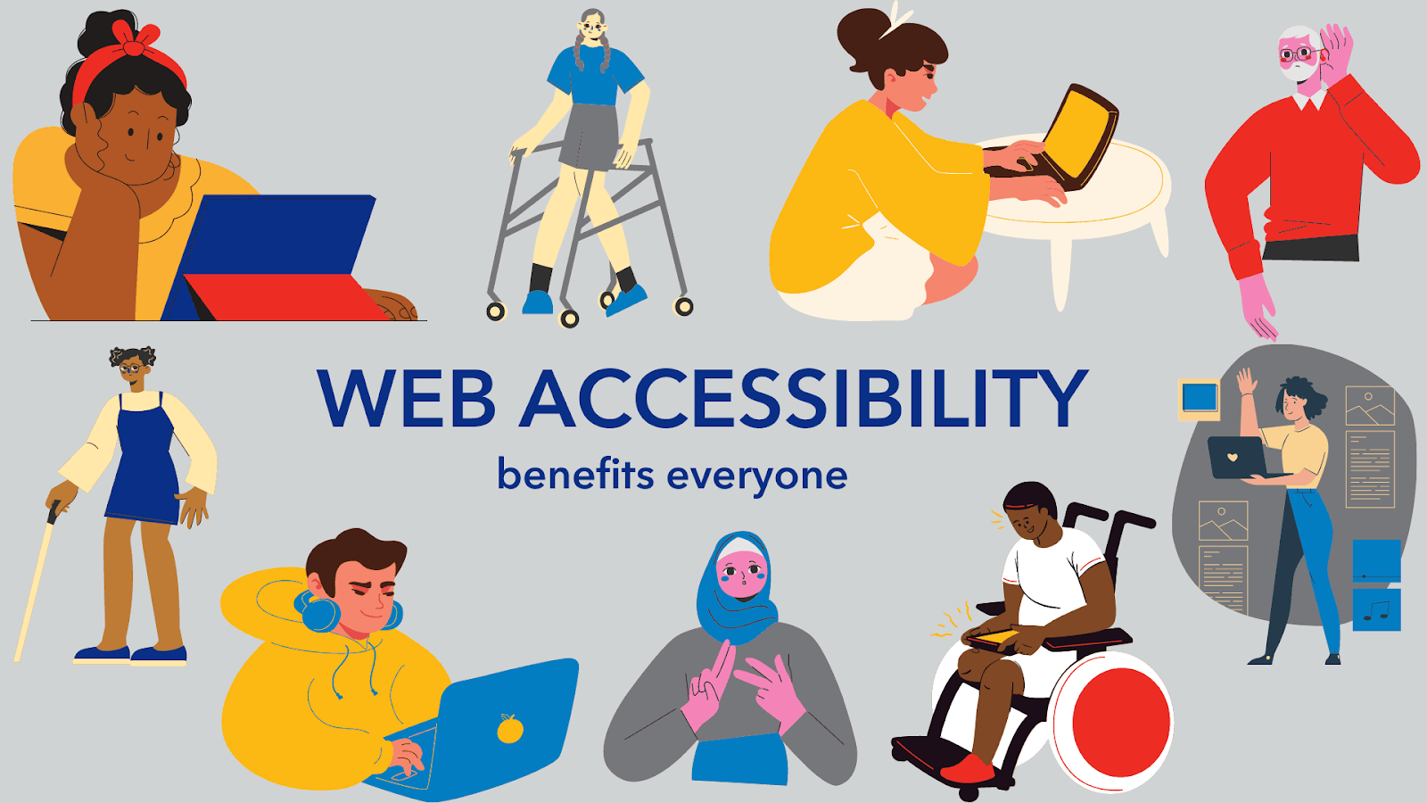
In some cases, these design features are explicitly for persons with disabilities, but as with accessible design in other contexts, designing for accessibility can significantly enhance user experience for all of us.
Think curb cuts used by a parent pushing a stroller, or utilizing a ramp with a small child.
In fact, accessible design choices can and should complement or extend the value or function of other design elements (e.g., a handrail or a properly placed and worded sign).
In the case of content accessibility, from the heading structure of a document to its formatting and layout, to the use of visual media and graphical and typographical elements, design choices are applied to increase the usability of documents for the largest number of readers.
Accessibility principles
Our guidelines for accessibility are driven by five principles (the POMUR formula) (Perceivable, Operable, Mobile first, Understandable, Robust)
Perceivable
Information and user interface must be presentable to users in ways they can perceive.
All our users need to be able to process what’s on the screen. Is there anything on our site that a low-vision or color-blind user can’t perceive?
Make content perceivable
| Do | Don’t |
| Make sure images and videos have captions. | Don’t write meaningless captions |
| Include meaningful alt text and captions for images. | Don’t publish any image without alt text and caption (except for decorative images) |
Color and contrast
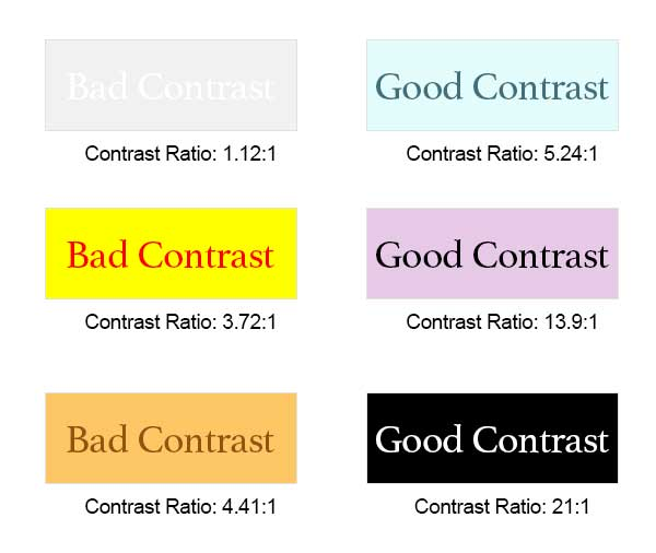
Some of our users are low-vision or color blind. They may need lots of contrast between background and text. Some people use screen magnifiers, and others just prefer to zoom or enlarge text to make things easier to read.
| Do | Don’t |
| Check your contrast. Is there enough between foreground text and background color? | |
| Linked text should stand out from body text. | |
| Include icons with text to make things clear. | Don’t use images of text. It’s not screen-reader friendly and can’t be enlarged when someone zooms in on the screen. |
| Focus indicators should be visible on fields and all interactions. |
Typography
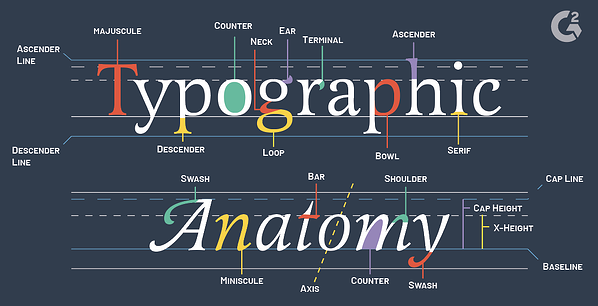
Typography is the art of arranging letters and text in a way that makes the copy legible, clear, and visually appealing to the reader.
It involves font style, appearance, and structure, which aims to elicit certain emotions and convey specific messages. In short, typography is what brings the text to life.

Font face, size, and weight are all elements to consider when designing for readability and legibility.
Some low-vision people use screen magnifiers or zoom in to enlarge text and make things easier to read.
It is recommended to use Sans-serif fonts instead of Serif fonts.
Operable
User interface components and navigation must be operable.
Make sure interactions and targets are well separated and easy to hit. Keep screens feeling “light”—don’t make them overly dense. Be aware of how longer content can appear on a screen.
Touch targets should be visually identifiable, especially on mobile screens. Is it clear what to do next?
Mobile first
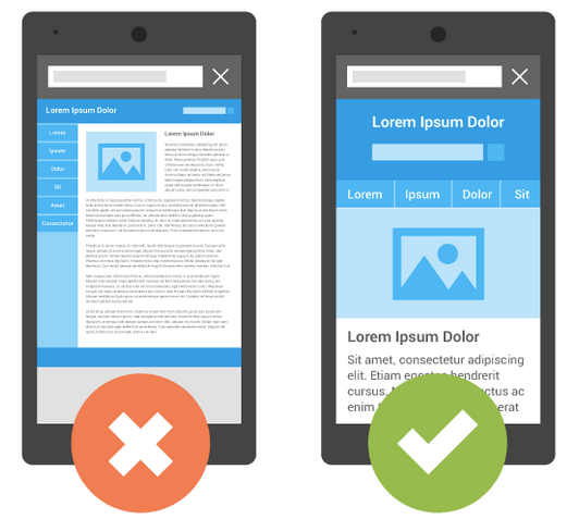
Mobile-first means we design content for the smallest screen and work our way up.
All our content – no matter the screen size – should be simple, concise, and focused. Small screens force us to write this way, so a mobile-first approach can help us create better experiences for all devices.
As you move from smaller to bigger screens, resist the urge to add more content just because you can. Embrace the white space. White space improves legibility. When something has room to breathe, when the leading is comfortable and the elements aren’t jammed together, everything is easier to read (which is something all readers appreciate).
Customers appreciate simplicity, no matter what device they’re using.
How mobile is different
- On a smaller screen, text looks longer and more overwhelming.
- Mobile users are likely to be multitasking (driving, ordering coffee) or in distracting places (elevators, sidewalks).
- Small touchscreens are error-prone. Each additional tap increases the chance of making a mistake. Give enough space between CTAs.
- Typing on a touchscreen takes longer and feels harder.
- In portrait mode, there’s very little horizontal space. Elements will usually need to stack vertically instead of showing side by side.
- You can see less content at once. Scrolling to find what you need can feel like work.
- There’s no hover. You have to tap to see more info.
Mobile content checklist
- Keep it short. Be brutal!
- Prioritize info customers need to move forward.
- Give info in bite-sized chunks.
- Use progressive disclosure (ex.: links to more info).
- No word walls. Use bullets or other visual breaks.
- Pair words with icons for scannability.
- Put important info and CTAs above the fold.
- Make CTAs easy to tap: big and not too close together.
- Make sure your text is readable on all screen sizes.
Understandable
Information and the operation of the user interface must be understandable.
Make Content Readable
- Keep content clear and easy to read and listen to. Remember that when someone is using a screen reader, the content is spoken aloud.
- Present only the info users need, and only when they need it.
- Keep sentences simple. Aim for 5th to 8th grade readability.
- Use images to support copy. Illustrations and graphs should be used to clarify complex concepts.
Information Hierarchy and Layout
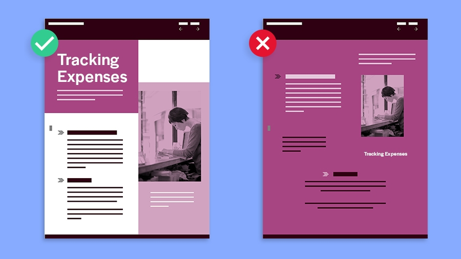
- Make page titles unique and informative.
- Keep heading styles consistent. Use typography and styles to provide meaning and structure.
- Make sure the correct HTML is used (H1, H2, etc.) so that screen readers can easily interact with the page structure. (Search engines also use these to analyze your content.)
- Use headings, subheadings, and bullet points to make content easy to scan. Headings and subheadings should always be nested and consecutive. Never skip a header level for styling reasons. To help group sections, be sure the page title is H1, top-level sections are H2s, and subsequent inside those are H3 and beyond. Avoid excessive nesting.
Robust
Content must be robust enough that it can be interpreted reliably by a variety of user agents, including assistive technologies.
Make sure things work well across platforms, browsers, and devices—different assistive technologies work better in some areas than others.
Try to be platform-agnostic.
Don’t dictate the technologies a customer has to use.
Accessible content guidelines
Write content with screen readers in mind
Some of our users can’t see. They use screen readers when doing things on the web. Someone can tell a screen reader to only read headings (h1, h2, and so forth), or to skip from section to section, or just from link to link.
| Do | Don’t |
| Use descriptive captions for images. If the text is meant to be read, don’t put it in an image. | Don’t refer to where things physically appear on a screen. |
| Write meaningful link text. Long text links can be partially hidden in the code for people using screen readers. | |
| Create text alternatives for charts and graphs. |
Keep it simple for all users
Some of our users have cognitive impairments or learning disabilities. These folks need content that is simple, clear, and direct to help focus their attention.
| Do | Don’t |
| Keep sentences short and simple. Aim for 5th-8th grade readability. | Don’t make lines longer than 75 characters, or sentences longer than 20 words. |
| Use images to support content. Illustrations and graphs can clarify complex concepts. | |
| Pair icons with text labels to provide contextual cues and help with comprehension. | |
| Keep user interface terms (menu, tabs, etc.) consistent throughout the screen. |
Aim for 5th to 8th grade readability
Our readability target is 5th to 8th grade. This might feel low, but it helps customers understand complex technical content faster and easier. It also supports our writing guidelines on shorter sentences, simple tenses, and familiar words.
Use the Hemingway app to test your content and learn what grade level or years of education is needed for someone to understand it.
Use Descriptive Caption for Images
Caption is used to describe images and adds context in association to the content. The lack of image caption is one of the most common accessibility errors on the web. We’re all responsible for adding captions to images, icons, and other visual media.
What is a caption?
Caption is a short description of an image for people who use screen readers or other assistive technology, or who have slow internet access. Caption makes images and their intent perceivable to a wider audience.

When to use captions?
If an image is important enough to be included in your design, caption is required to go along with it for accessibility. Think of it this way: If an image fails to load, what text makes sense in its place? What does that image represent? What is its specific purpose for being there? Use that for the caption.
The language will depend on the purpose of the image:
- If it’s a creative photo or supports a story, describe the image in detail in a brief caption.
- If the image is serving a specific function, describe what’s inside the image in detail. People who don’t see the image should come away with the same information as if they had.
- If you’re sharing a chart or graph, include the data in the caption so people have all the important information.
For example, look at this picture:

A caption that says “A happy young woman drinking coffee from a paper cup on city street” conveys more purpose and emotion than “A woman drinking coffee.”
Each browser handles captions differently. Supplement images with standard captions when possible.
You don’t need captions for decorative images that aren’t associated with the content.
Just define the image as decorative for developers or leave the alt blank (alt=“”).
| Do | Don’t |
| Be clear and concise so readers can visualize the content without seeing it. | Don’t be too minimal or too complex. |
| If the image has text, include that in the caption. | Don’t include “picture of” or “image of.” This is already assumed. |
| If the image represents an action, describe it. | Don’t stuff captions with keywords—it can be seen as spam. But more importantly, it’s not kind for people who use screen readers. |
| Make sure buttons have alt text that describes their function, such as “Check Price” or “Check Price at Amazon” | Don’t neglect metadata and alt text for buttons. |
| Start with a capital letter. Screen readers will emphasize it more, which may help separate it from the rest of the text. | |
| Keep below 125 characters, the standard cutoff for most screen readers |
Style
Our readers don’t usually notice editorial style unless we get it wrong. Follow these guidelines to make sure editorial errors don’t distract users from moving forward.
Formatting
We keep additional formatting of copy at a minimum. The words themselves should be precise and presented in a clear enough way that they shouldn’t require any additional emphasis or special treatment (such as bold, underline, etc.). In some cases, though, we do format copy for clarity.
Follow these guidelines:
Acronyms & abbreviations
If there’s a chance our reader won’t recognize an abbreviation or acronym, spell it out the first time you mention it. Then use the short version for all other references. If the abbreviation isn’t clearly related to the full version, specify in parentheses.
- First use: tire pressure monitoring system (TPMS)
- Second use: TPMS
Bold
Don’t use bold copy as a substitute for appropriately coded second- and third-level headings (like H2 and H3).
Don’t make headings bold, they are coded to be bold automatically.
Use bold content sparingly. It can call attention to something important, but if overused, it can have the opposite effect, making a screen look chaotic, cluttered, and intimidating.
Capitalization
We use a few different forms of capitalization.
Title case: capitalizes the first letter of every word except articles (e.g. a, an, the), prepositions (e.g. in, on, at, etc.), and conjunctions (e.g. and, but, yet, etc.).
Examples:
- 9 Best OBD2 Scanners in 2023 [Review] (“in” is a preposition)
- How to Test an O2 Sensor in 5 Minutes (“to” and “in” are prepositions, “an” is an article)
Sentence case: capitalizes the first letter of the first word.
Examples:
- BlueDriver is the best Bluetooth OBD2 adapter in 2022. (Letter “B” in the word “BlueDriver” is capitalized)
- Choosing the right scan tool is REALLY hard. (Letter “C” in the word “Choosing” is capitalized)
Lowercase: When writing out an email address or website URL, use all lowercase.
- [email protected]
- obdadvisor.com
Don’t capitalize random words in the middle of sentences.
Here are some words that we never capitalize in a sentence.
- website
- internet
- online
Italics
Try to avoid italics in copy.
Only use bold to emphasize text if necessary.
Lists
Bulleted lists
A bulleted list shows users content that is focused, organized, and easy to scan.
A bulleted list should:
- Include no more than 5 items.
- Have no more than one bulleted list on a screen.
- Begin bullets with an initial capital letter.
- End with a period if it’s a sentence. If it’s a question, end with a question mark.
- Use parallel construction for items. If one item starts with a verb, every item should start with a verb. If one item ends in punctuation, every item should end in punctuation.
Numbered lists
A numbered list shows the order in which actions should occur, when events will take place, or order of importance:
- Introduce the list with a lead-in sentence, fragment, heading, or question. Use a question mark if it’s a question.
- Begin each numbered item with an initial capital letter (unless you’re using the list items to complete the sentence).
- Don’t use and, or, or and/or at the beginning of any list item.
- Use parallel construction for your list items. If one item starts with a verb, every item should start with a verb.
- Make sure each step includes only one action or two closely related actions (e.g. Turn the car key to “ON” and plug the scan tool to the OBD2 port and ). That helps us keep the steps simple.
- Write all items in the same voice (usually active) and tense (usually present). Fragments are fine, but if one item is a complete sentence, try to write them all that way. Or turn that odd sentence into a fragment.
- Use a period at the end of each list item if it’s a complete sentence, and keep punctuation consistent. Don’t use commas or semicolons at the end of list items.
Tables
The following cell alignments are preferred, but use your best judgment to create a clear, easy-to-scan table.
- Right-align numbers in columns.
- Left-align words in columns.
- Short words (3 letters or less) may look better..
- Column headings should be left-aligned for text, center-aligned for numbers.
Note that tables present major accessibility issues. Screen readers have a hard time reading through the content in tables to make it useful.
| Do | Don’t |
| Use tables primarily for numerical information. | Don’t include full sentences—or worse, paragraphs—in tables. That kind of content is better presented in body copy. |
| Formatting should be consistent within the table itself and with any nearby tables. | Don’t use tables to condense lists or include text beyond a few words per cell. |
| If possible, fit the size of the table to the viewer displaying it. | Avoid tables within tables for online content. Usually there’s not enough room to properly display such complex tables onscreen. |
| Set off table headings and row headings, if needed. Usually, a table title is unnecessary. Use the same font in the table as the surrounding content. | Don’t use special fonts or font sizes in the table. |
Text alignment
| Left alignment | Centered alignment | Right alignment | Justified alignment |
| By default, align paragraphs and text longer than 2 lines to the left. Since our eyes jump fast down left-aligned content, it’s easier and quicker to read. Left-aligned text makes things look more polished and aesthetically pleasing. | When reading center-aligned content, our eyes have to scan both sides of the text. This takes us longer than reading left-aligned text since we have to find where the next line begins.Center alignment is best for headlines and short, scannable lines. Keep content 1–2 lines in length. Any longer and you sacrifice readability for the sake of visual aesthetics. | Use right alignment in tables, cards, and widgets for numbers and times. Numbers are easy to compare at a glance with the left-aligned info opposite it. | Never use justified alignment. |
Underlines
Don’t underline copy unless it’s for links.
Inline links should be underlined (or some other non-color visual distinction) for accessibility. They’re surrounded by text and need an underline to be recognizable as an interactive element.
Links that stand alone do not need to be underlined because they have ample white space to be recognizable as interactive.
Contractions
They’re great! We use contractions (Don’t, isn’t, I’m, we’re, etc.) in our writing to give it an informal and friendly tone.
Emoji
Emoji are a fun way to add humor and visual interest to your writing, but you are not encouraged to use them.
URLs and websites
Capitalize the names of websites and web publications. Don’t italicize. (e.g. OBD Advisor)
Avoid spelling out URLs, but when you need to, leave off the https://www. (e.g. obdadvisor.com/bluedriver)
Links
Links guide users to other destinations or files. We use them to link to help content or to download forms or other resources. In some cases, we use links for a call to action (CTA).
How to write links
The best structure for a link that’s a call to action is a verb and a direct object. This helps users understand where they’re likely to go and encourages them to go there. (e.g. Grab the E-book Now)
Should you punctuate a link? Depends on the context.
If it’s a CTA, try to create a separate linked CTA for accessibility, rather than linking it within a sentence.
| Do | Don’t |
| Use descriptive text for the link. Try to set contextual expectations about what’s behind it.Find out more about OBD2 scanners with live data.See more about BlueDriver. | Don’t use specific actions (Click here) or locations (here) for the link text. Try not to use Learn more, which isn’t descriptive enough, except for space-constrained designs.Click herehereLearn more |
| Write the link to be large enough for users to select. At least 8 characters is a good length. | Don’t write link text longer than 6 words (about 55 characters). |
Don’t go wild with links
- Don’t use links in headlines.
- Don’t add links to every possible resource. Present the most helpful ones.
- Don’t put multiple links to the same place on the same page.
People, places, and things
File extensions
When referring generally to a file extension type, use all uppercase without a period. Add a lowercase s to make plural.
- JPGs
When referring to a specific file, the filename should be lowercase:
- ford-obd1-codes-list.pdf
- bmw-warning-lights.jpg
Pronouns
If your subject’s gender is unknown or irrelevant, use “they,” “them,” and “their” as pronouns.
Use “he/him/his” and “she/her/her” pronouns as appropriate.
Don’t use “one” as a pronoun.
Quotes
When quoting someone in a blog post or other publication, use the present tense.
- “Using OBD Advisor helps me find a suitable scan tool,” says Terry James.
Names
The first time you mention a person in writing, refer to them by their first and last names. On all other mentions, refer to them by their first name.
Schools
The first time you mention a school, college, or university in a piece of writing, refer to it by its full official name. On all other mentions, use its more common abbreviation.
- Georgia Institute of Technology, Georgia Tech
- Georgia State University, GSU
States, Cities, and Countries
Spell out all city and state names. Don’t abbreviate city names.
Per AP Style, all cities should be accompanied by their state, with the exception of: Atlanta, Baltimore, Boston, Chicago, Cincinnati, Cleveland, Dallas, Denver, Detroit, Honolulu, Houston, Indianapolis, Las Vegas, Los Angeles, Miami, Milwaukee, Minneapolis, New Orleans, New York, Oklahoma City, Philadelphia, Phoenix, Pittsburgh, St. Louis, Salt Lake City, San Antonio, San Diego, San Francisco, Seattle, Washington.
On first mention, write out the United States. On subsequent mentions, the US is fine. The same rule applies to any other country or federation with a common abbreviation (European Union, EU; United Kingdom, UK).
Slang and jargon
Write in plain English.
If you need to use a technical term, briefly define it so everyone can understand.
Numbers
Spell out a number when it begins a sentence.
Otherwise, use the numeral. This includes ordinals.
- Three of the 10 scan tools in this review are made for beginners.
- I’ll walk you through the top 5 scan tools of 2023.
- The 1st step is to turn the key to the “ON” position.
Numbers over 3 digits get commas:
- 999
- 1,000
- 150,000
Write out big numbers in full. Abbreviate them if there are space restraints, as in a tweet or a chart: 1k, 150k.
Dates
Generally, spell out the day of the week and the month. Abbreviate only if space is an issue.
- Saturday, January 24
- Sat., Jan. 24
Decimals and fractions
Spell out fractions.
- Do: two-thirds
- Don’t: 2/3
Use decimal points when a number can’t be easily written out as a fraction, like 1.375 or 47.2.
Percentages
Use the % symbol after a number instead of spelling out “percent.”
Ranges and spans
Use a hyphen (-) to indicate a range or span of numbers.
- It takes 20-30 days.
Money
When writing about US currency, use the dollar sign before the amount. Include a decimal and number of cents if more than 0.
- $20
- $19.99
Telephone numbers
Use dashes without spaces between numbers. Use a country code if it is in another country.
- 555-867-5309
- +1-404-123-4567
Measurement units
Only use measurement units that are popular in the US.
- Length/Distance: Inches, feet, yards, and miles
- Weight/Mass: Ounces, pounds, and tons
- Volume: Fluid ounces, cups, pints, quarts, gallons
- Temperature: Fahrenheit
Time
Use numerals and “a.m.” or “p.m.”, with a space in between. Don’t use minutes for on-the-hour time.
- 7 a.m.
- 7:30 p.m.
Use a hyphen between times to indicate a time period.
- 7 a.m.–10:30 p.m.
Specify time zones when writing about an event or something else people would need to schedule.
Abbreviate time zones within the continental United States as follows:
- Eastern time: ET
- Central time: CT
- Mountain time: MT
- Pacific time: PT
When referring to international time zones, spell them out: Nepal Standard Time, Australian Eastern Time. If a time zone does not have a set name, use its Coordinated Universal Time (UTC) offset.
Abbreviate decades when referring to those within the past 100 years.
- the 00s
- the 90s
When referring to decades more than 100 years ago, be more specific:
- the 1900s
- the 1890s
Punctuation
Apostrophes (‘s)
The apostrophe “’s” most common use is making a word possessive. If the word already ends in an “s” and it’s singular, you also add an “’s”. If the word ends in an “s” and is plural, just add an apostrophe.
Do: Jack’s iPhone, The Johns’ restaurant
Don’t: The Johns’s restaurant.
Colons (:)
Use a colon (rather than an ellipsis, em dash, or comma) to offset a list.
Do: The top 3 OBD2 code readers of 2023 are: AUTEL AL319, FOXWELL NT301, and ANCEL AD310.
Don’t: The top 3 OBD2 code readers of 2023 are—AUTEL AL319, FOXWELL NT301, and ANCEL AD310.
Don’t: The top 3 OBD2 code readers of 2023 are, AUTEL AL319, FOXWELL NT301, and ANCEL AD310.
Commas (,)
When writing a list, use the serial comma (also known as the Oxford comma).
- Do: The top 3 OBD2 code readers of 2023 are AUTEL AL319, FOXWELL NT301, and ANCEL AD310. (use comma before “and”)
- Don’t: The top 3 OBD2 code readers of 2023 are AUTEL AL319, FOXWELL NT301 and ANCEL AD310. (no comma before “and”)
Otherwise, use common sense. If you’re unsure, read the sentence out loud. Where you find yourself taking a breath, use a comma.
Dashes and hyphens (—) (-)
Use a hyphen (-) without spaces on either side to link words into a single phrase, or to indicate a span or range.
Example:
- first-time user
- Monday-Friday
Use an em dash (—) without spaces on either side to offset an aside. Only use a true em dash, not hyphens (- or –).
Example:
Live data display—just one of BlueDriver’s features—can help you see how well the engine is running.
Note: To type an em dash, hold down the Alt key and type 0151 for an em dash (—) or 0150 for an en dash (–).
Ellipses (…)
Ellipses (…) can be used to indicate that you’re trailing off before the end of a thought. Use them sparingly.
Don’t use them for emphasis, and don’t use them in titles or headers.
Example:
“Where did all those donuts go?” Christy asked. Lain said, “I don’t know…”
Ellipses, in brackets, can also be used to show that you’re omitting words in a quote.
Example:
“When in the Course of human events it becomes necessary for one people to dissolve the political bands which have connected them with another and to assume among the powers of the earth, […] a decent respect to the opinions of mankind requires that they should declare the causes which impel them to the separation.”
Periods (.)
Periods go inside quotation marks. They go outside parentheses when the parenthetical is part of a larger sentence, and inside parentheses when the parenthetical stands alone.
| Do | Don’t |
| Christy said, “I ate a donut.” | Christy said, “I ate a donut”. |
| I ate a donut (and I ate a bagel, too). | I ate a donut (and I ate a bagel, too.) |
| I ate a donut and a bagel. (The donut was Sam’s.) | I ate a donut and a bagel. (The donut was Sam’s). |
Note: Leave a single space between sentences.
Question marks (?)
Question marks go inside quotation marks if they’re part of the quote.
Like periods, they go outside parentheses when the parenthetical is part of a larger sentence, and inside parentheses when the parenthetical stands alone.
| Do | Don’t |
| Tim asked, “Which scan tool do you like?” | Tim asked, “Which scan tool do you like”? |
| Which scan tool do you like (and which don’t you like)? | Which scan tool do you like (and which don’t you like?) |
| (Don’t you like BlueDriver?) | (Don’t you like BlueDriver)? |
Exclamation points (!)
Use exclamation points sparingly, and never more than one at a time. They’re like high-fives: A well-timed one is great, but too many can be annoying.
Exclamation points go inside quotation marks.
Like periods and question marks, they go outside parentheses when the parenthetical is part of a larger sentence, and inside parentheses when the parenthetical stands alone.
| Do | Don’t |
| Tim said, “Wow. It’s wonderful!” | Tim said, “Wow. It’s wonderful”! |
| He didn’t choose BlueDriver (What a pity)! | Which scan tool do you like (and which don’t you like?) |
| She chose BlueDriver (That’s wonderful!) | She chose BlueDriver (That’s wonderful)! |
Quotation marks (“ ”)
Use quotes to refer to words and letters, titles of short works (like articles or posts), and direct quotations.
Periods and commas go within quotation marks. Question marks within quotes follow logic—if the question mark is part of the quotation, it goes within. If you’re asking a question that ends with a quote, it goes outside the quote.
| Do | Don’t |
| He said: “It’s not the scan tool I want.” | He said: “It’s not the scan tool I want”. |
| He asked: “Which code reader do you prefer?” | He asked: “Which code reader do you prefer”? |
| Do you like “Gone with the Wind”? | Do you like “Gone with the Wind?” |
Use single quotation marks for quotes within quotes.
- Who was it that said, “A fool and his donut are easily parted?”
- Brad said, “A wise man once told me, ‘A fool and his donut are easily parted.’”
Semicolons (;)
Go easy on semicolons. They usually support long, complicated sentences that could easily be simplified. Try an em dash (—) instead, or simply start a new sentence.
Example:
| Do | Don’t |
| You take the car to the dealer to turn it off. But they charge you $100-$200 to have it diagnosed. | You take the car to the dealer to turn it off; but they charge you $100-$200 to have it diagnosed. |
| You don’t even have to set it up. Just plug it in, and the code reader will turn on automatically. | You don’t even have to set it up; just plug it in, and the code reader will turn on automatically. |
Ampersands (&)
Don’t use ampersands unless one is part of a company or brand name.
| Do | Don’t |
| Ben & Jerry’s (Because this is a company name) | Ben and Jerry’s |
| Ben and Dan | Ben & Dan (Because this is NOT a brand or company name) |
Writing about OBD Advisor
Our website name is “OBD Advisor”.
Abbreviation: OA
Always capitalize the “OBD” and the letter “A” and lowercase other letters in OBD Advisor.
Refer to OBD Advisor as “we”, not “it.”
Writing about Other Companies or Products
Honor companies’ own names for themselves and their products.
Go by what’s used on their official website.
- Amazon
- iPhone
- YouTube
- AUTEL
- INNOVA
- LAUNCH
- BlueDriver
- AUTEL MaxiCOM MK808S (or AUTEL MK808S)
Refer to a company or product as “it” (not “they”).
Write Positively
Use positive language rather than negative language.
One way to detect negative language is to look for words like “can’t,” “don’t,” etc.
| Do | Don’t |
| To get a donut, stand in line. | You can’t get a donut if you don’t stand in line. |
Use Active Voice
Active voice makes the sentence clearer, shorter, and simpler.
Try to avoid passive voice.
The readers will find it easier to collect information in an active voice sentence rather than a passive voice one.